
AOZORA Airlines
Logo & Brand Identity
Introducing Aozora Airlines, a premium international airline that sets itself apart by offering exceptional customer service both in person and online. At Aozora Airlines, we are committed to providing a travel experience that combines the warmth of Japanese hospitality with the utmost luxury and comfort. Our goal is to make every aspect of your journey with us an enjoyable and memorable experience.
Plane Design
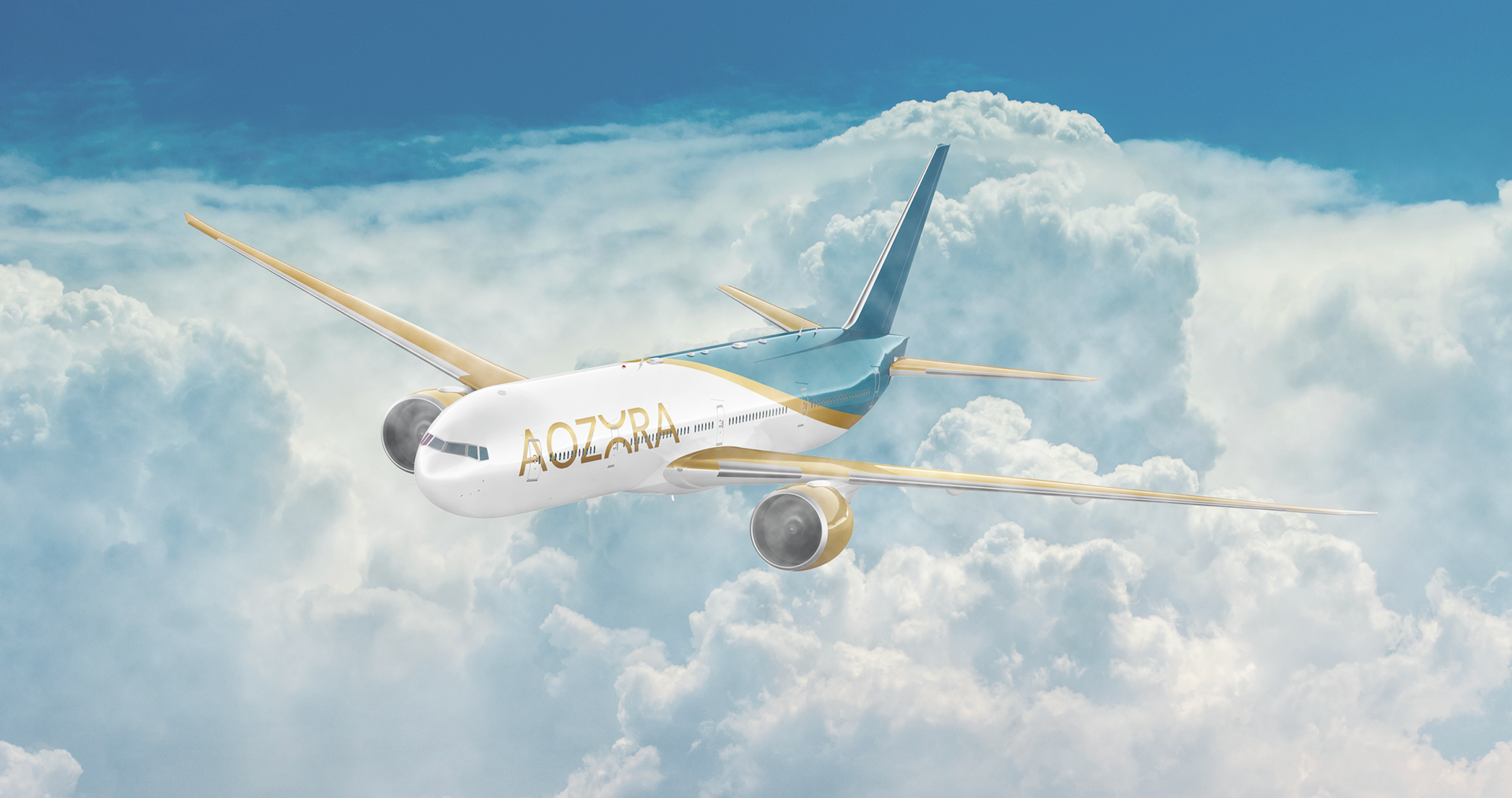
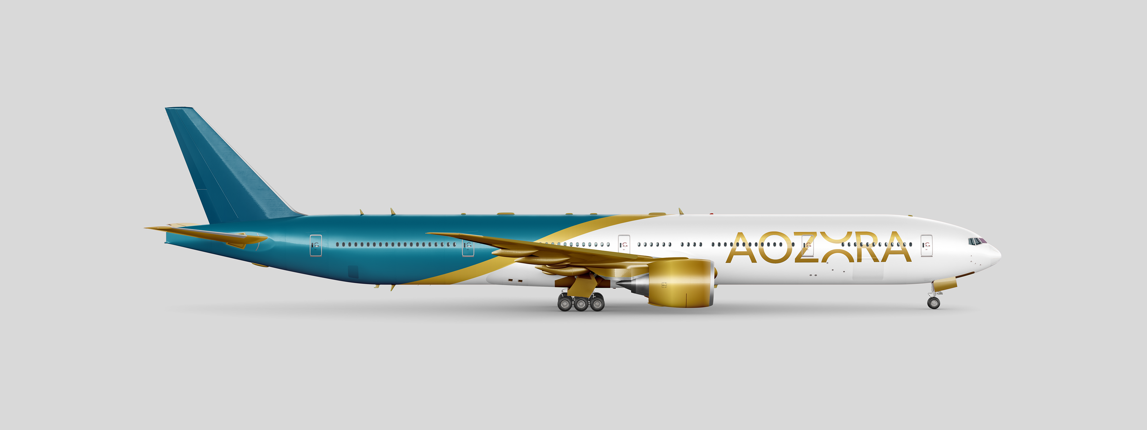
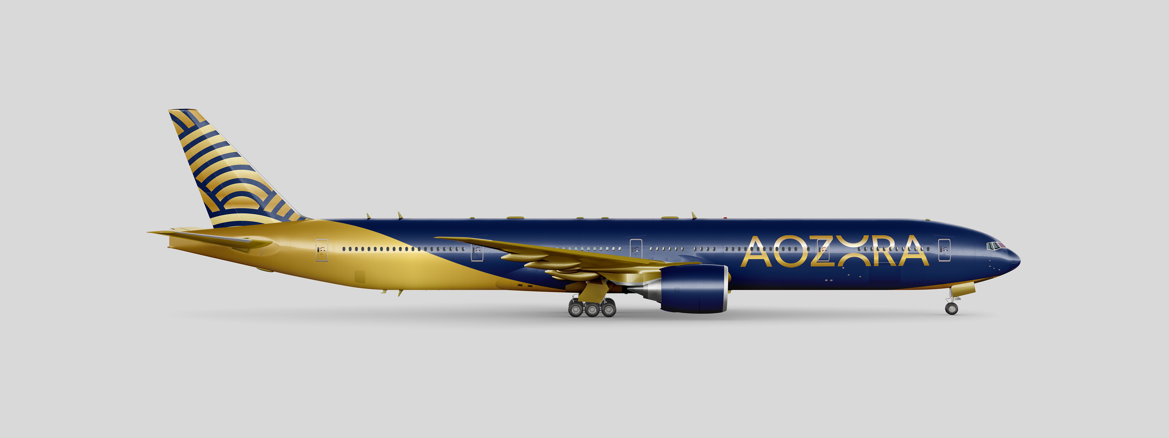
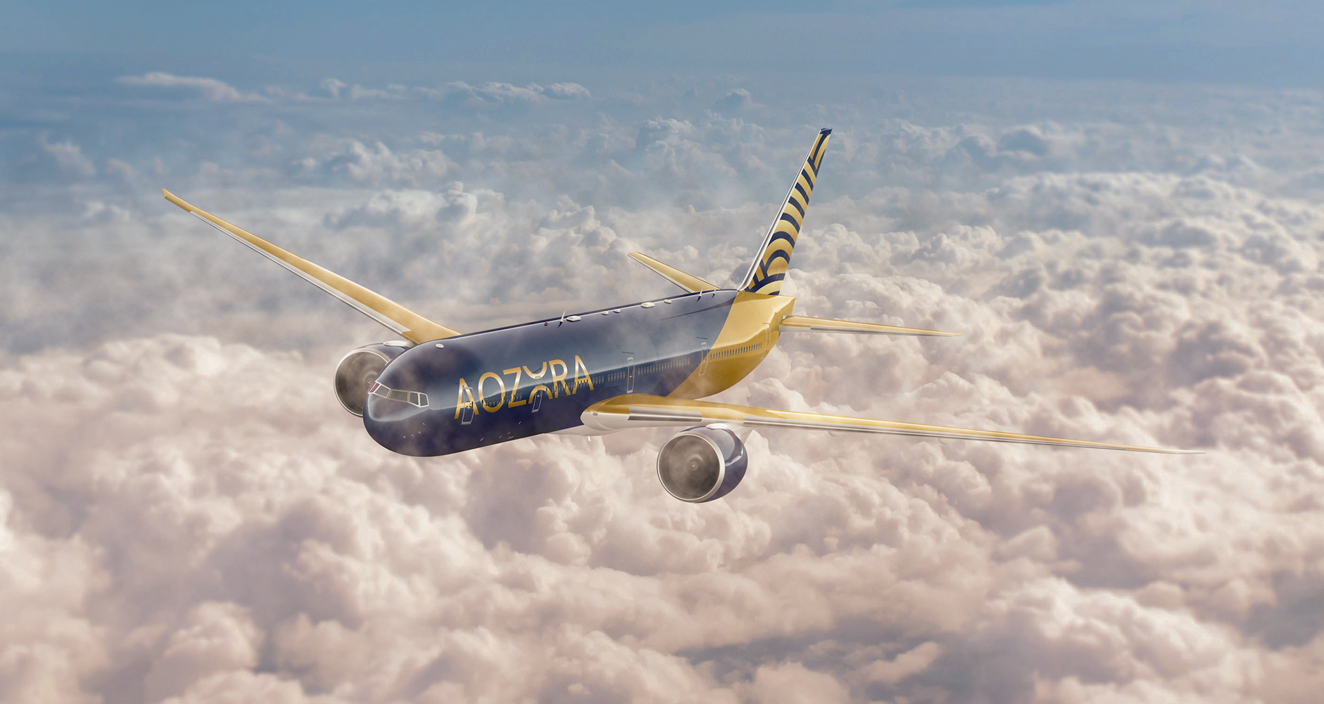
Aozora translates to "blue sky" in Japanese. Inspired by Japan's clear blue skies, the logo also features the color gold, which represents Japan's historical nickname as the "Golden Country".
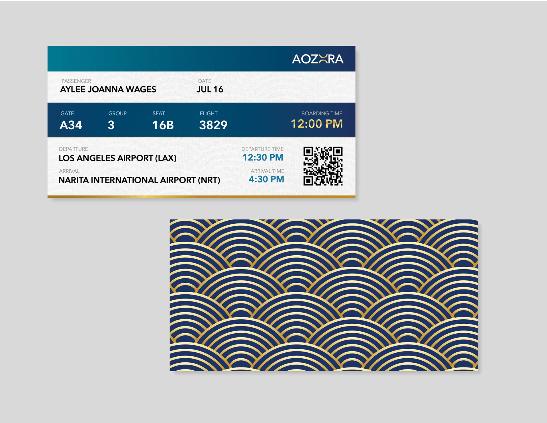
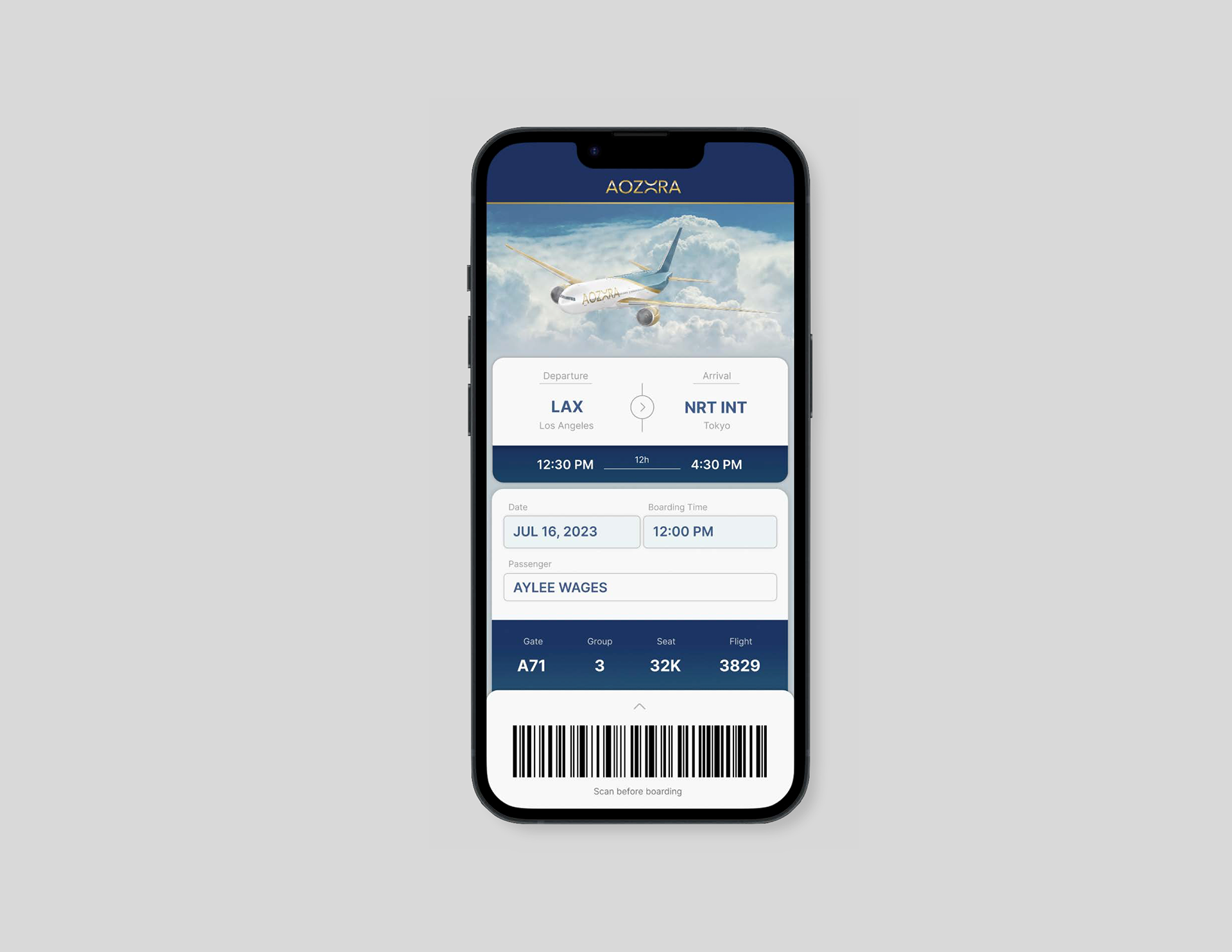
Print & Digital Ticket
Inspired by Japan's natural beauty, rich culture, and deep-rooted tradition of hospitality, this airline's branding embodies the concept of putting customers first and providing exceptional service.
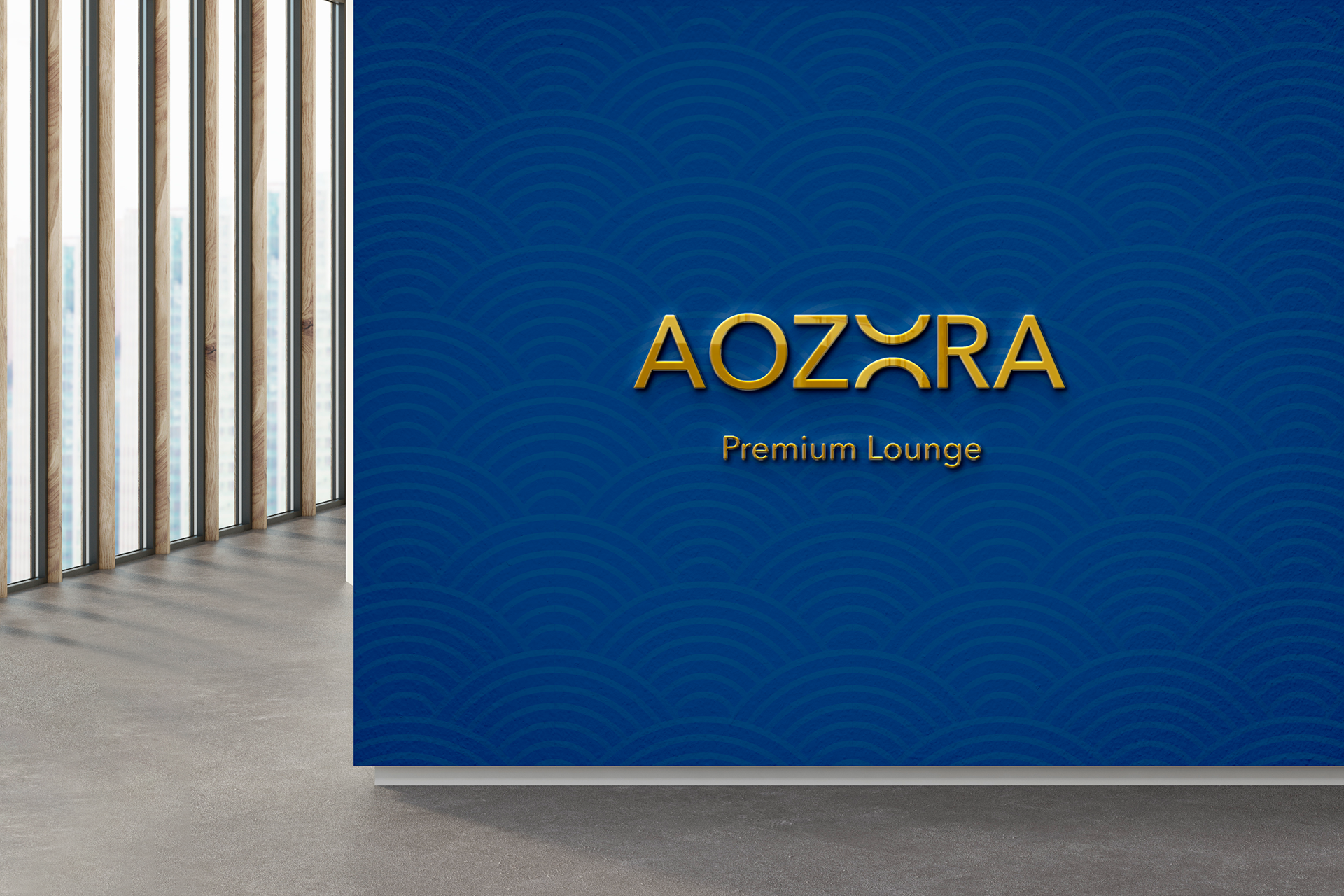
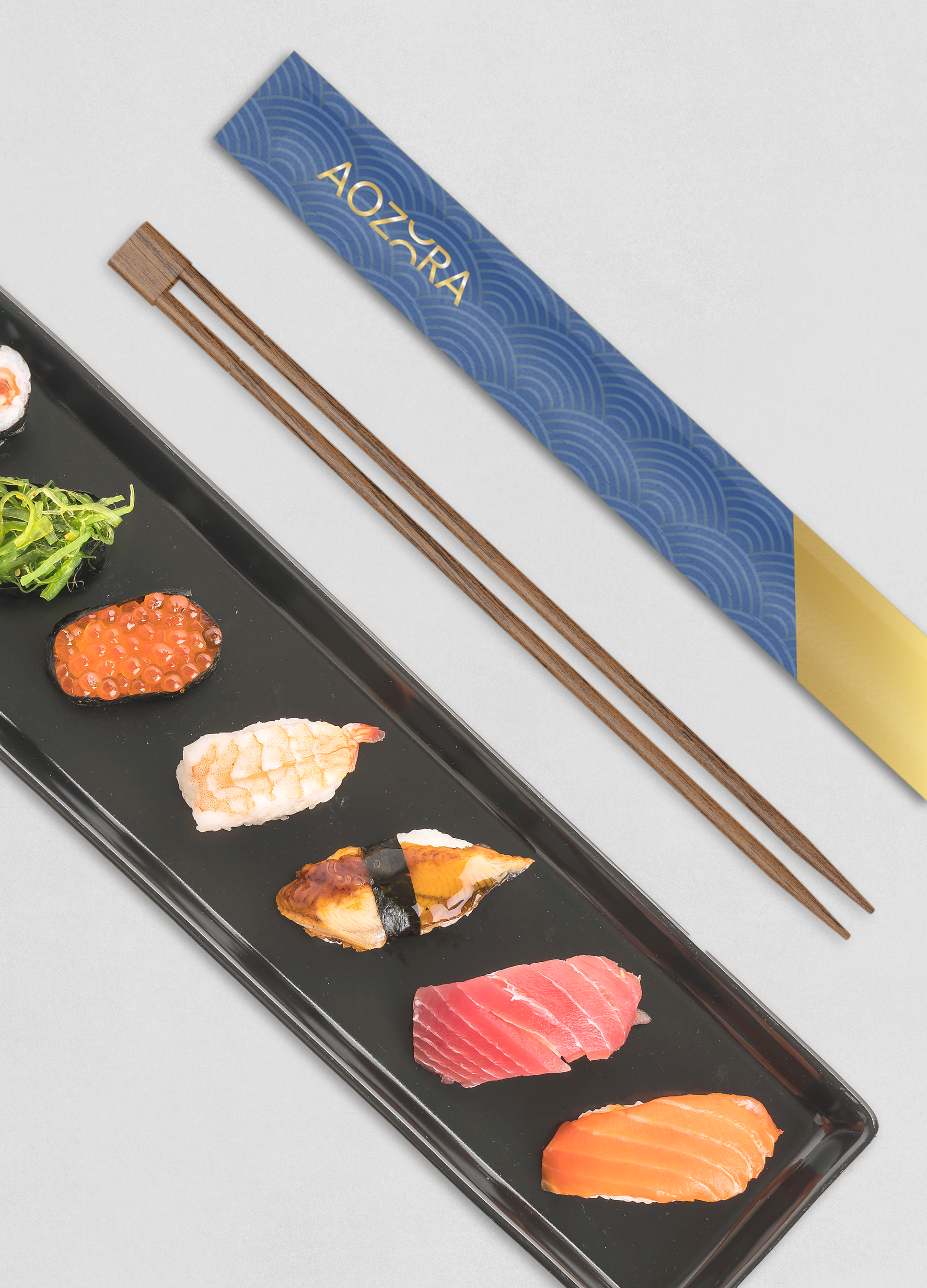
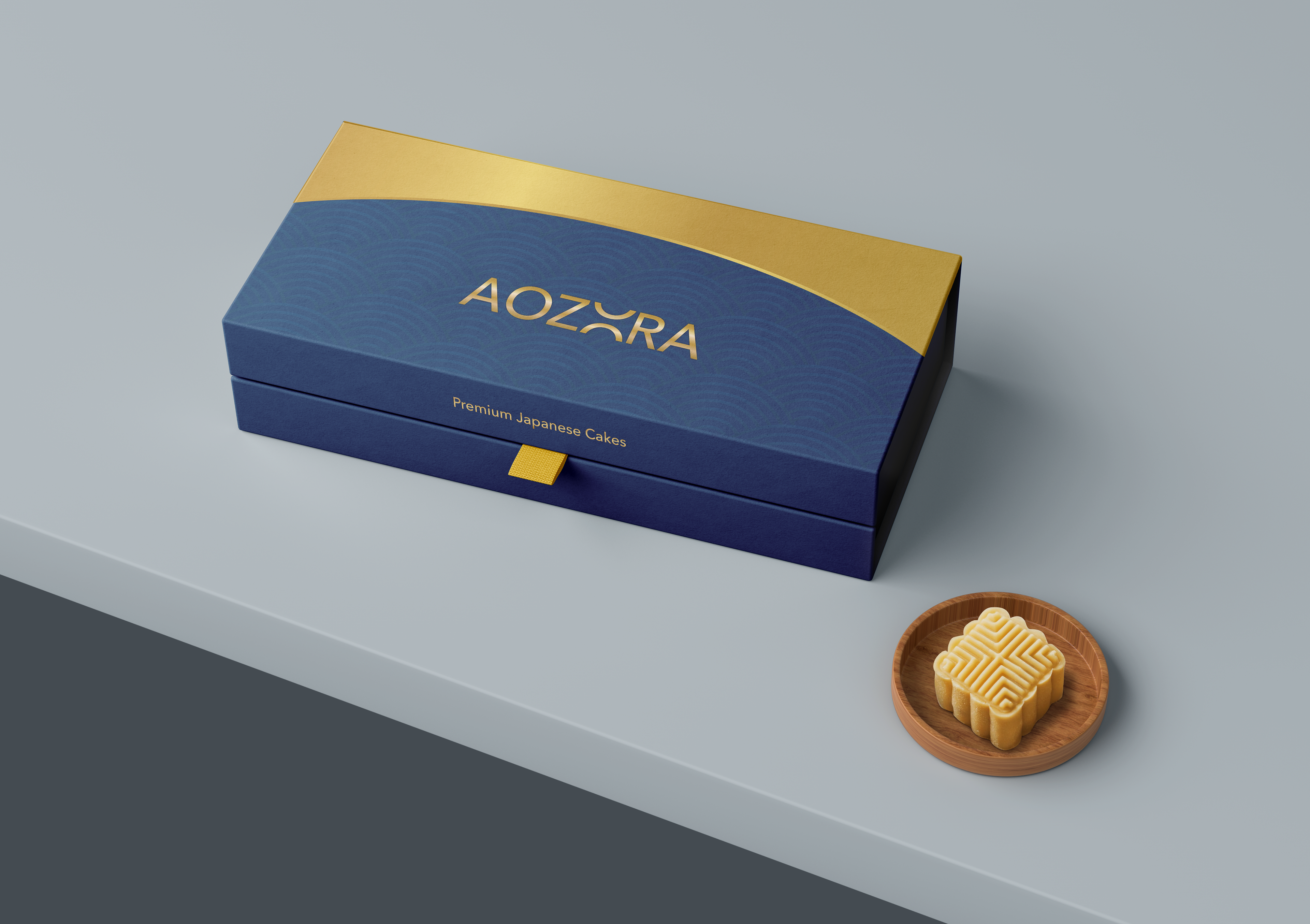
Branding Items

Logo Design
The letter 'O' represents both a sunrise and sunset, symbolizing the beginning and end of a journey. It also emphasizes the airline's commitment to offering customers a seamless and enjoyable travel experience from start to finish.
BTS


View Process Book →
Check out other projects! ↓